


Overview
Skills: UI/UX Design, Interaction Design, Visual Design
My Role: The only designer. Created full product design.
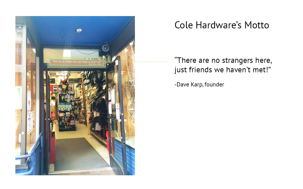
Challenge: Cole Hardware is a family hardware store that emphasizes a personal touch. They want to make online shopping easier while providing an alternative to the ‘big box’ experience.
Solution: Improve the online user experience without losing Cole Hardware’s heritage.
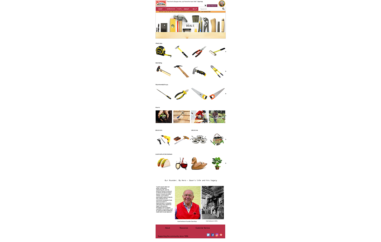
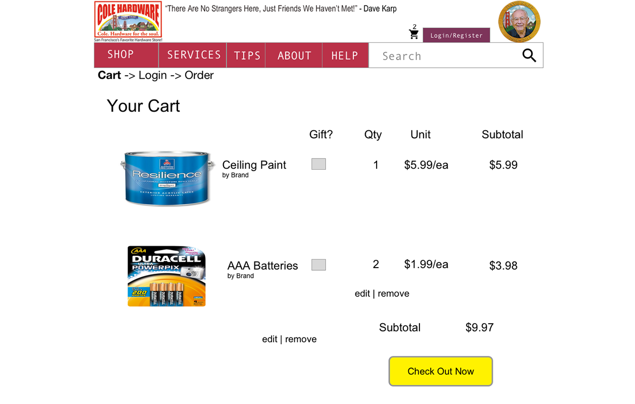
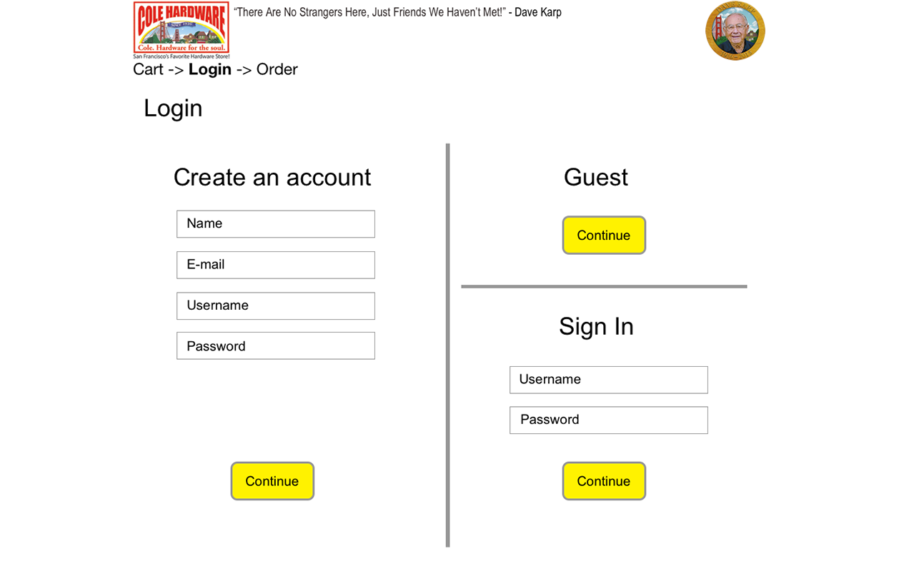
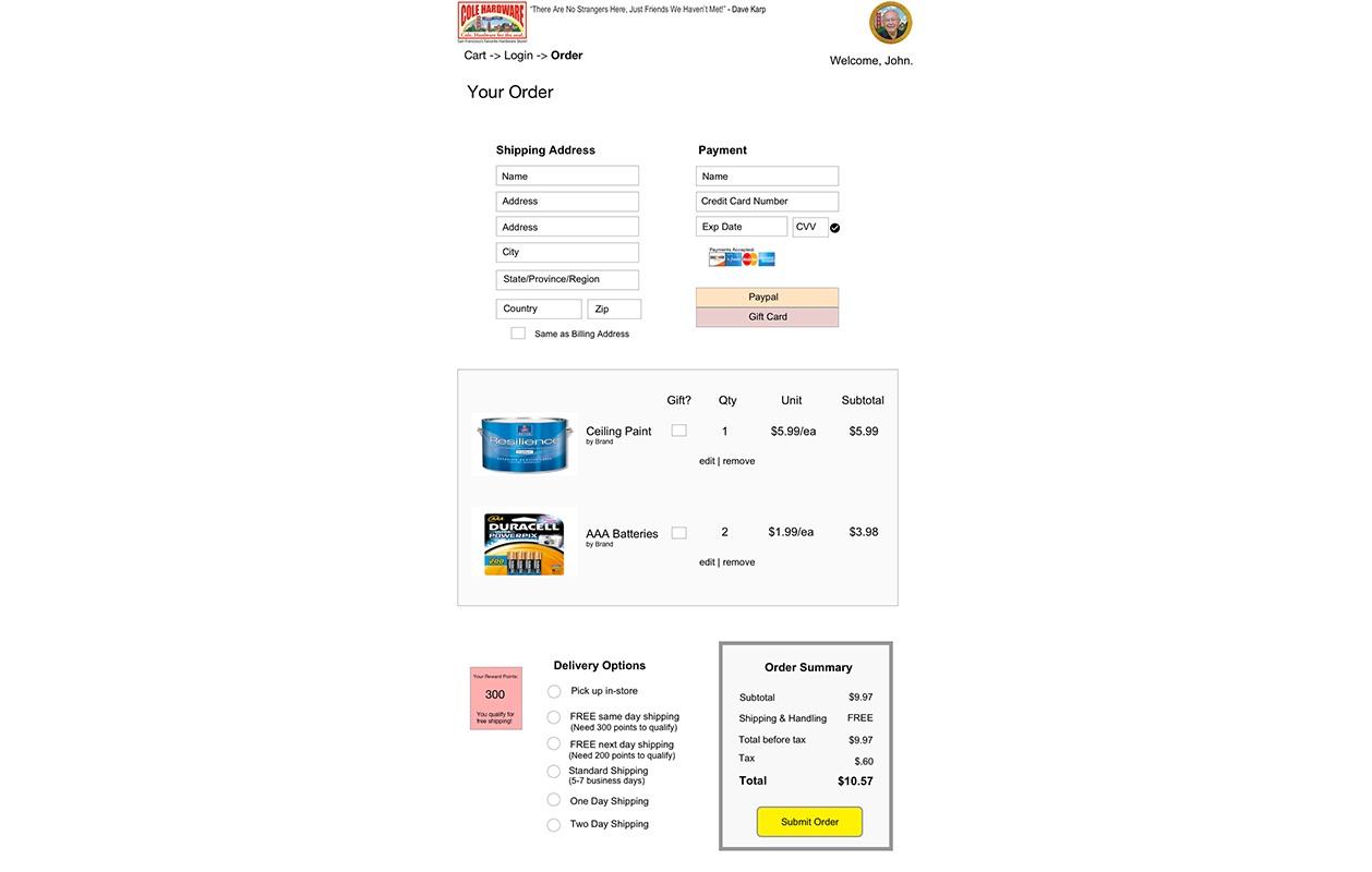
End Product: A website that has a clear structure, shorter check out flow, helpful shopping features, and personalization.

Before & After


How I Added Personalization


The Design Process
Company Research: To learn about Cole Hardware, I immersed myself in their website, store, news articles, and Yelp reviews. This helped me understand who they were and what their core values were, which were putting relationships first.
Competitive/Comparative Analysis: To learn more about the ecommerce industry, I looked at Home Depot and Amazon and compared the layout, speed of checkout, easiness, and helpfulness. I learned that Cole Hardware fell behind on all aspects compared to its competitors.

Personas: I used 3 personas — a DIY enthusiast, a newcomer looking for a gift, and an expert tradesman — to help me focus on the tasks they will encounter when using the site. Having personas help me stay grounded by having to consider each person's needs and goals.
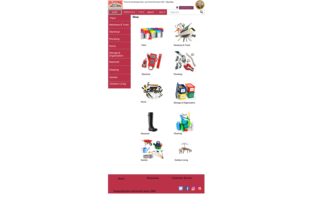
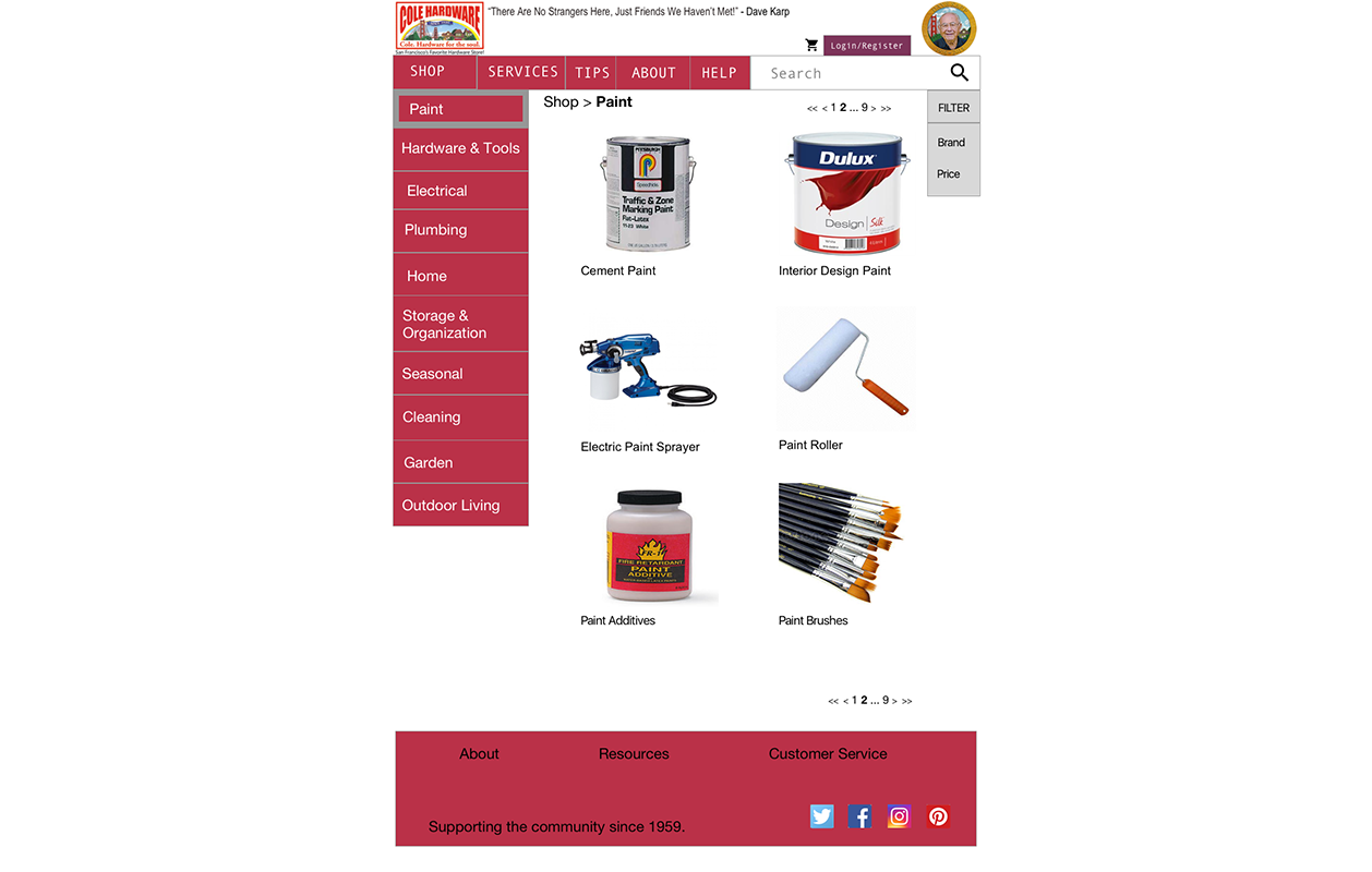
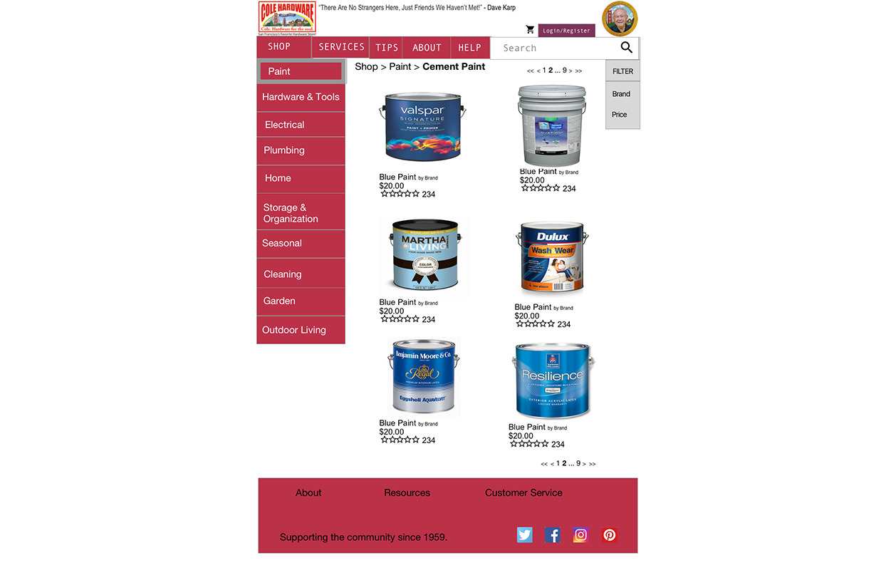
Information Architecture: The current website has an unclear navigation. I created a new navigation with clear titles and sorted pages on where they best fall under.

Sketching: To think of new layouts, I sketched different versions of each page. This helped me not stick to one design and allowed me to think more freely of other possibilities.

Wireframes: By starting off designing in black and white, it allowed me to evaluate more clearly the effectiveness of the content and the ease of purchasing without worrying about the colors.

Usability Testing: When testing the redesign with users, I learned that some of the information was confusing, which pushed me to ensure that every detail on each page was clear.

testing script - how i tested with users
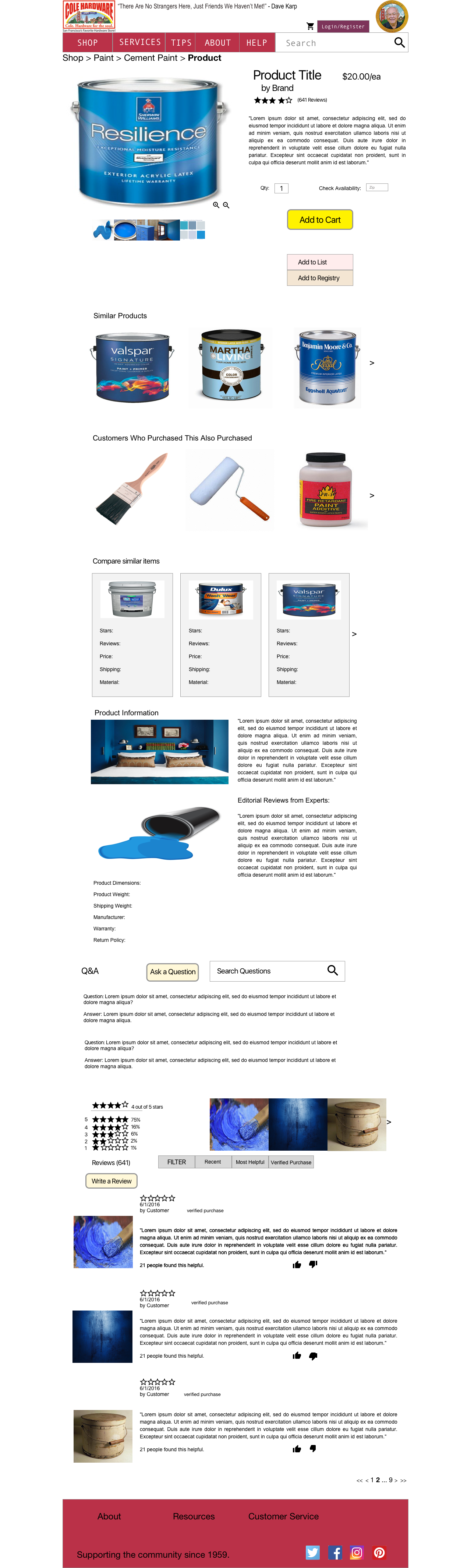
Visual Design: I kept Cole Hardware’s color, red, to show that their brand still exists in the new design. I added more imagery to grab attention, and a minimalistic style so the focus would be on the content.

Success Metrics: I measured success based on whether users completed the task, their level of satisfaction (1-10 score), their comments about it, and the amount of errors made.
Conclusion: The new design makes it easier to make purchases, browse other items, understand the categories, and learn about the products. The redesign uses personalization to incorporate Cole Hardware’s motto that they care about their customers.
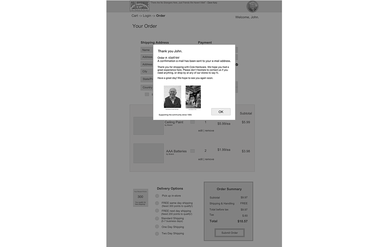
Alternate Version: Dave Karp, the late founder of Cole Hardware, always carried a special card trick as an ice breaker in his pocket. Everyone who knew him knew the card trick, and by adding an interactive game into the homepage, we can pay homage to Karp and continue the tradition to break the ice.

Details

Bay Alarm Medical

A notification + chat app
Veteran Affairs

A mental health app