


Overview
Skill: Interaction Design, UX Design
Team: 4 Designers
My Role: My role was to create the designs in a prototype, conduct user testing, and iterate based on feedback. I focused on whether the app's design was understandable and effective.
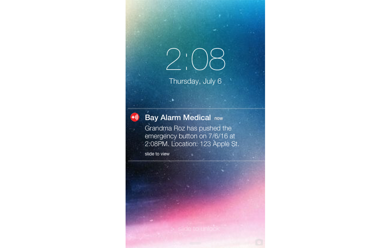
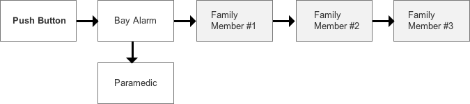
Challenge: Bay Alarm Medical is a medical alert system that provides seniors with fall-protection devices. When a senior uses the device, the company has to inefficiently call family members one-by-one.
Solution: An app for family members that instantly informs them of emergencies.
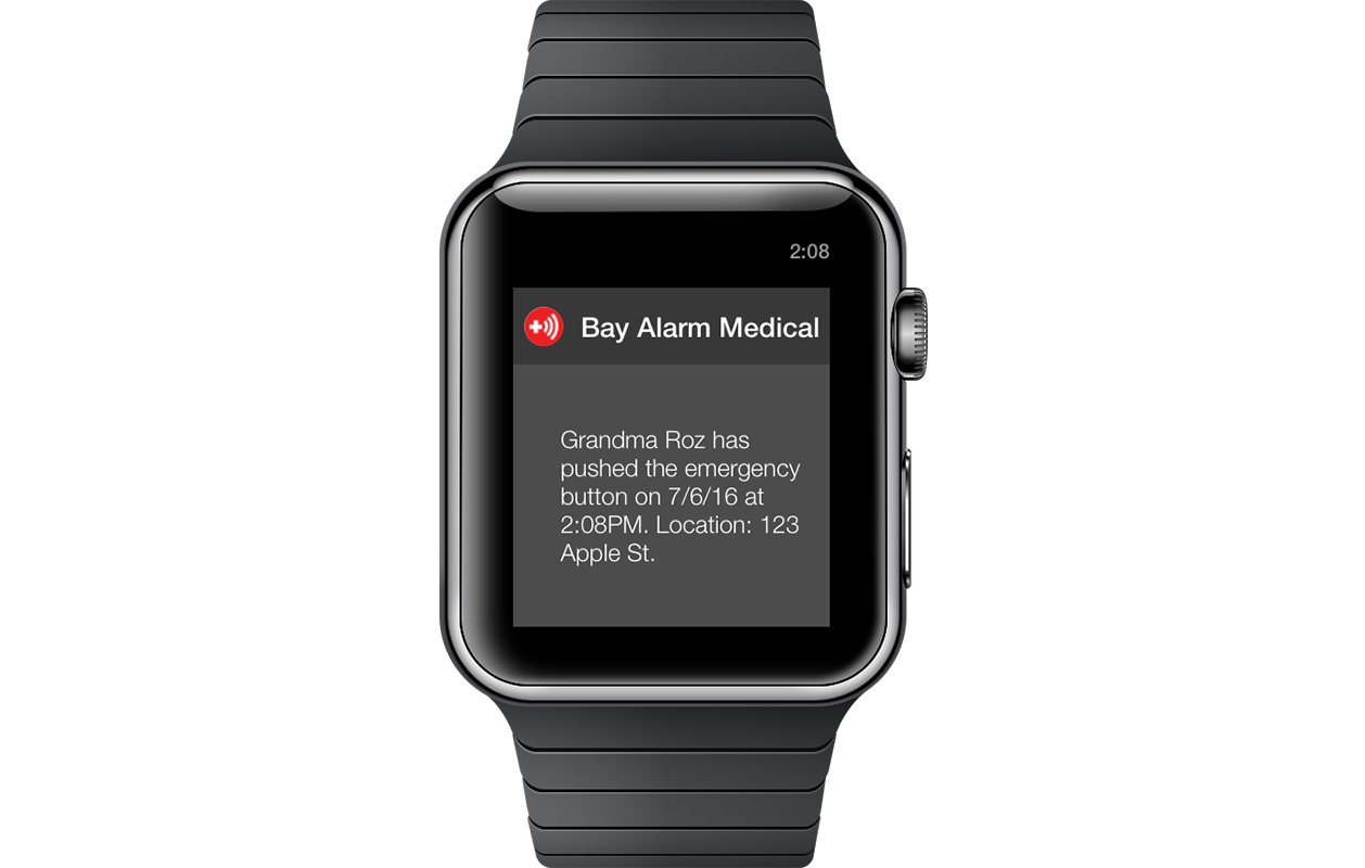
End Product: An app that embeds real-time notifications within a group chat.

The Design Process
Company Research: We started by doing a business analysis on Bay Alarm by going to their website and investigating how their system worked and what products they sold to give us a better understanding of who they were and what they do. We read customer reviews and news articles to see how real users and the public perceived Bay Alarm to help us learn what they were doing well in and what they can improve on.
current system
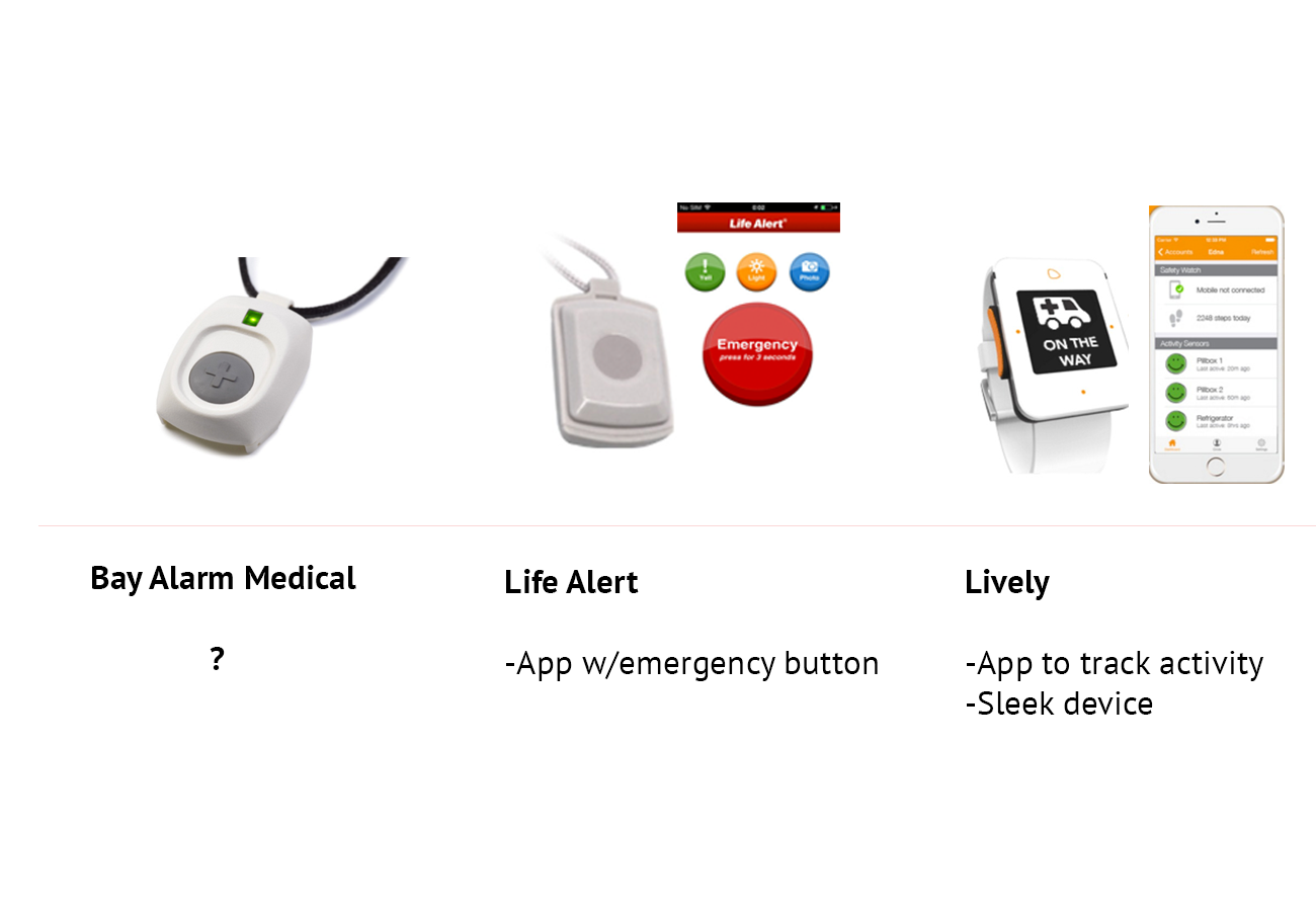
Competitive Analysis: We looked at Life Alert and Lively, two strong competitors, to find each company’s competitive advantage. Both already had apps out, which leads us to believe that Bay Alarm is not competitive enough in today's market.
User Research: After our investigation, we created a survey and sent it out to people who may be familiar with medical alert systems. Our goal was to learn about their experiences, wants, and needs in order to better understand the problem and craft the solution.

our survey
A teammate conducted 3 interviews with a grandma who uses the device, a physician familiar with this system, and a paramedic, which furthered our understanding of users' experiences and necessities.
Disclaimer: It was difficult to find an elderly or people familiar with medical alert systems. The target audience was small and we obtained information from 29 people, so our results may not be 100% representative of everyone.
Personas: After finding our target audience, we came up with the typical persons involved in this scenario and created 3 personas:
- The grandmother who lives alone and is prone to falling.
- The concerned daughter who wants to know what’s going on.
- The paramedic who wants to provide faster care.

Creating personas helped us see how different people interact in an emergency and served as a reminder to keep their goals in mind while designing.
Bodystorming Role-Playing Act: We acted out a scenario that involved our personas to help us empathize with each character and see how the new system would work in real life. We learned that an app could improve the experiences of everyone involved and that thinking about the whole system would need to be considered.

bodystorming: a role-playing act where we played out a story around our app
Sketching: After each team member individually sketched out the app, we combined ideas and noticed that we added many different features, such as heart rate tracking, sleep tracking, etc.
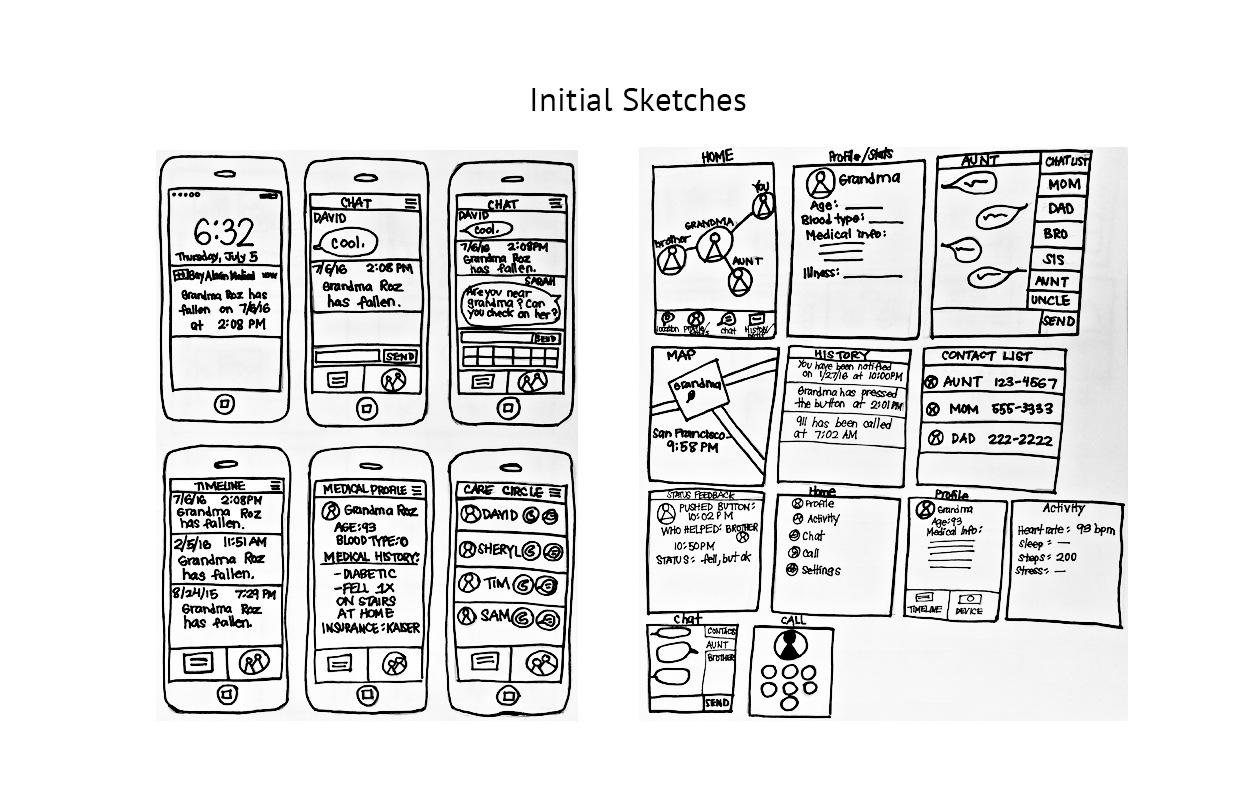
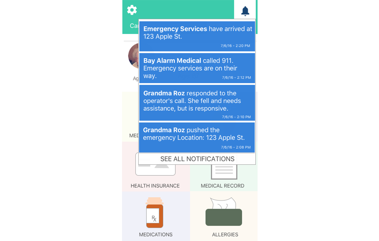
Feature Prioritization: Since we all wanted different features, we prioritized them based on the level of importance, which showed us that only one function was a requirement: notifications. With this in mind, our team had a clear understanding of the solution and were able to quickly focus on building a functional and efficient app that centered around notifications.

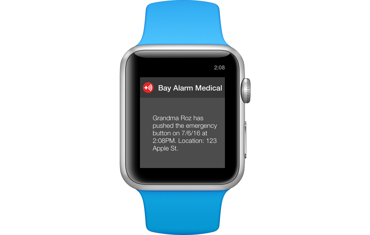
notifications will be the core of our mvp
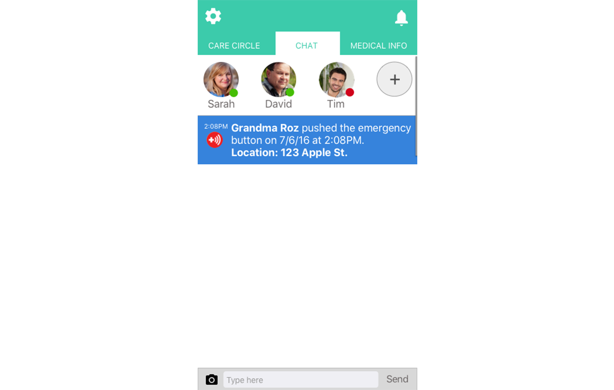
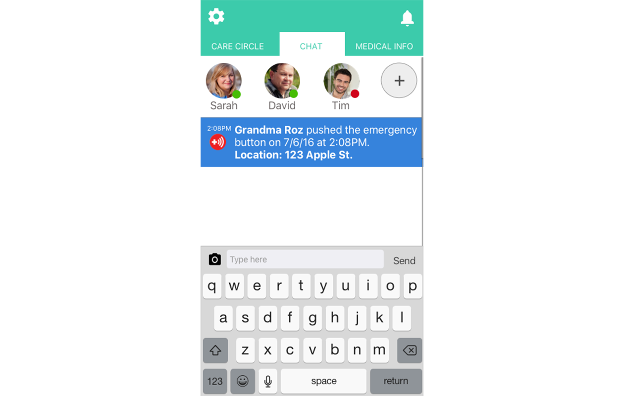
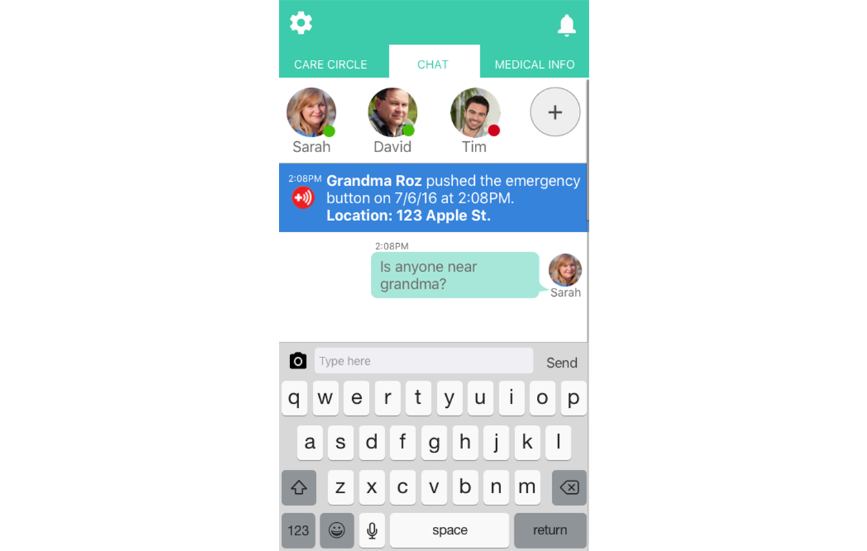
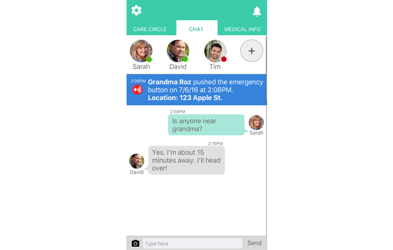
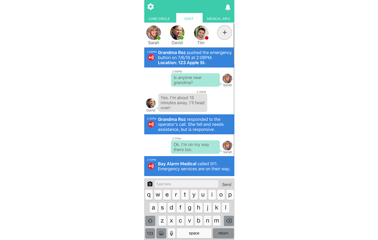
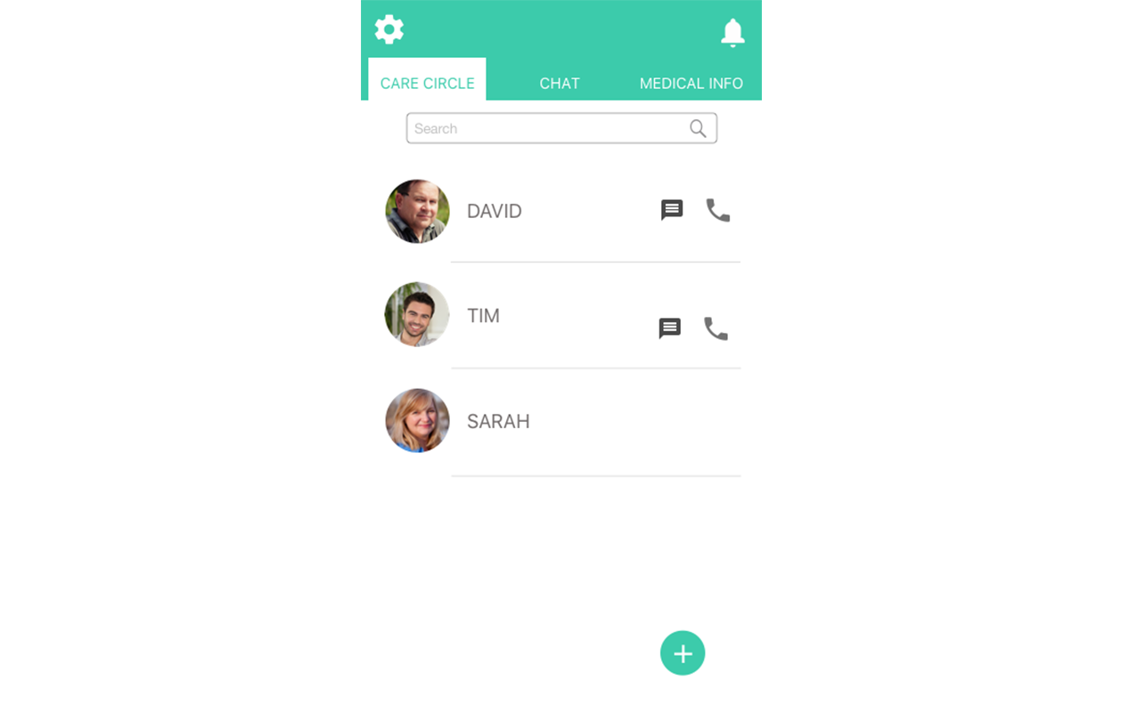
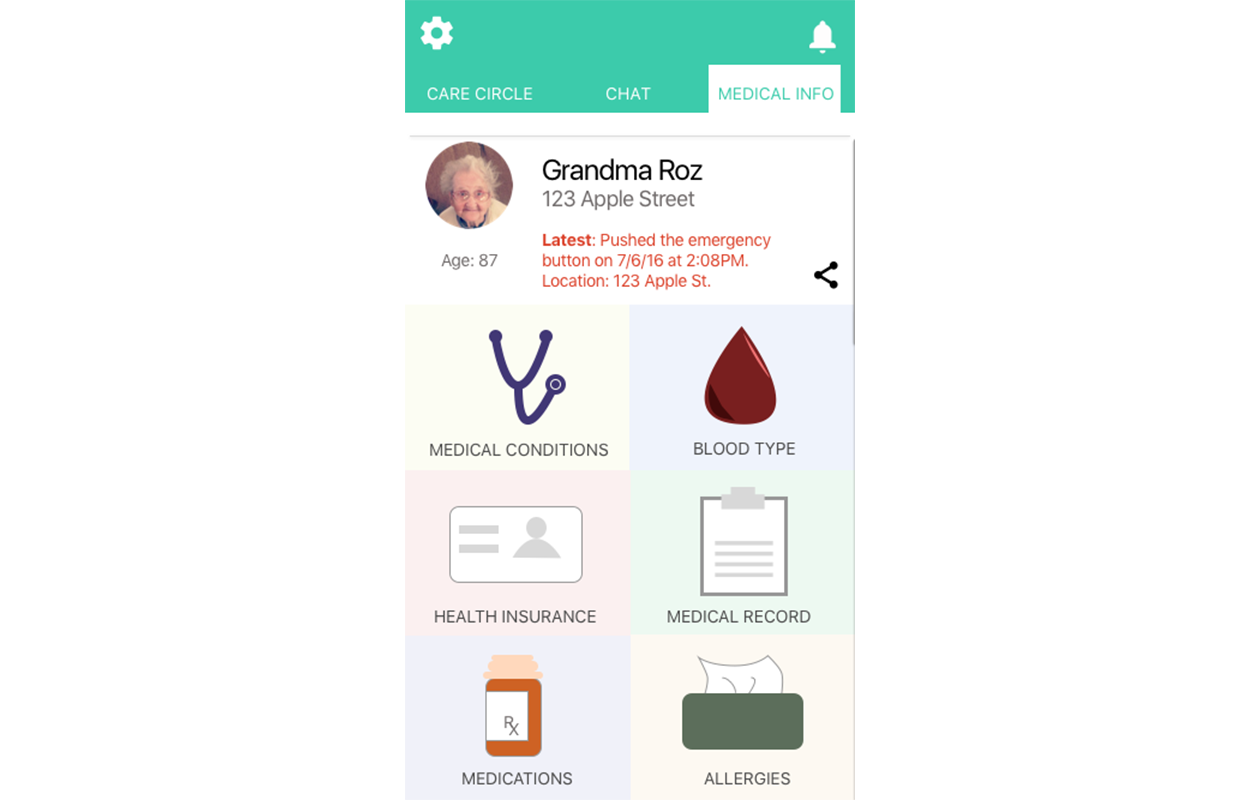
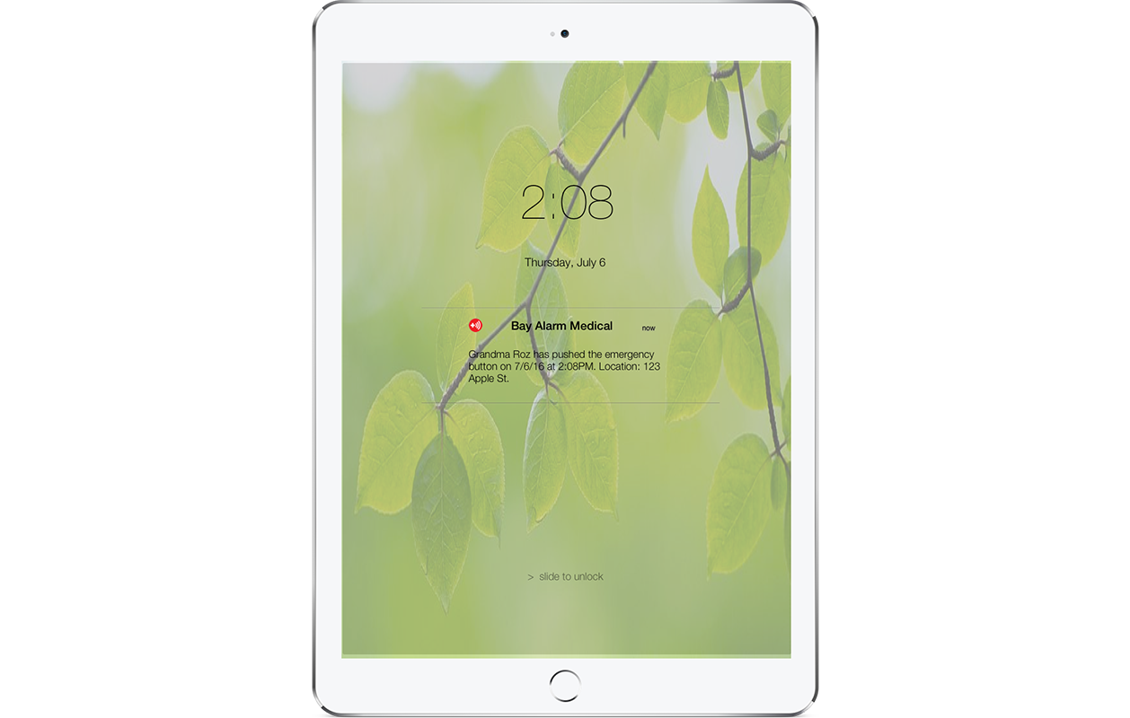
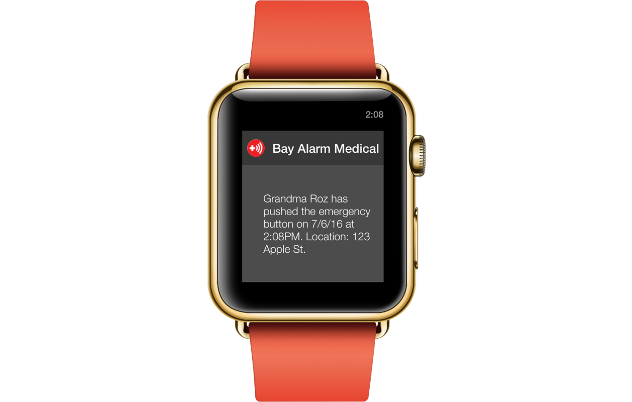
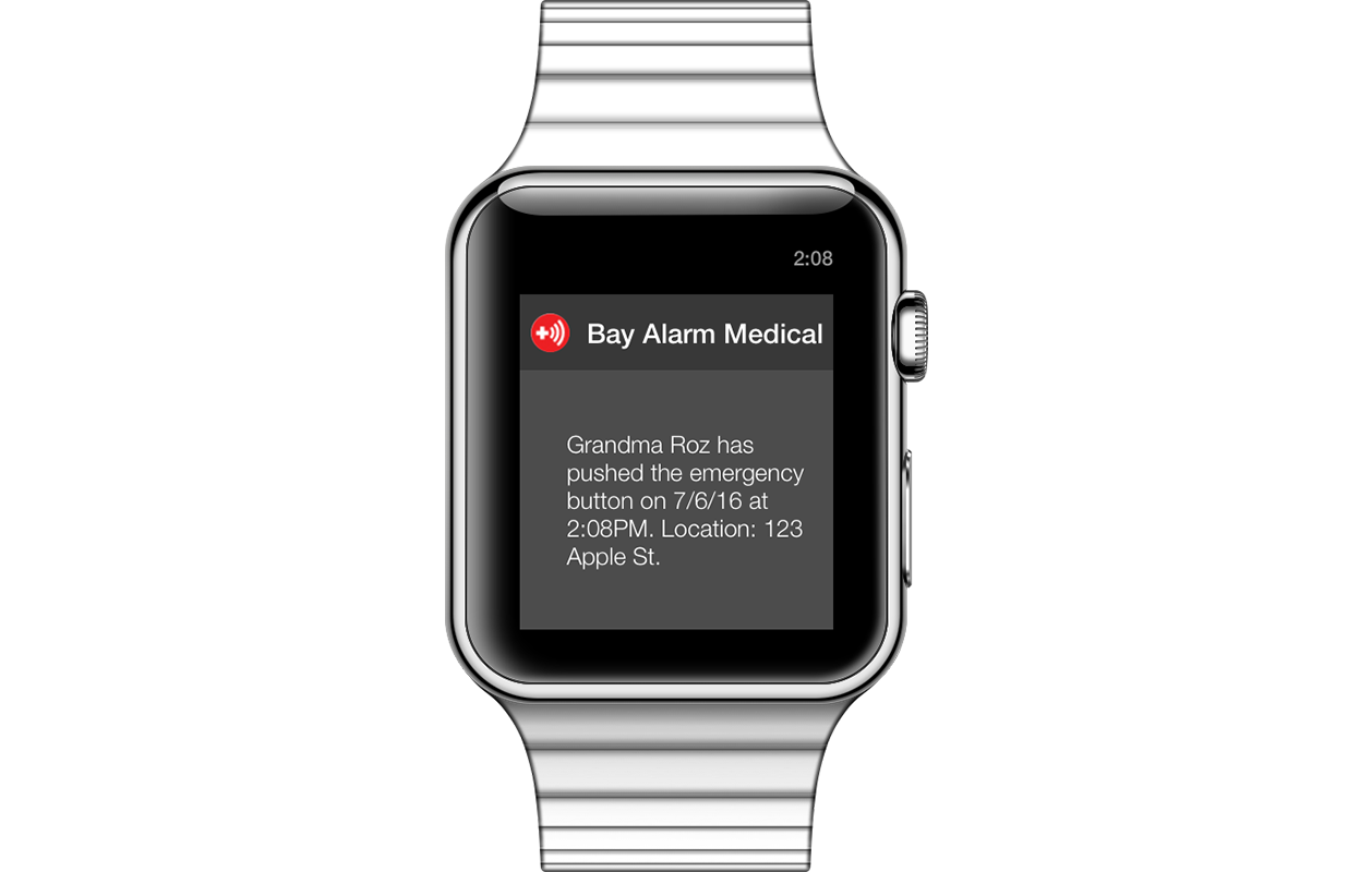
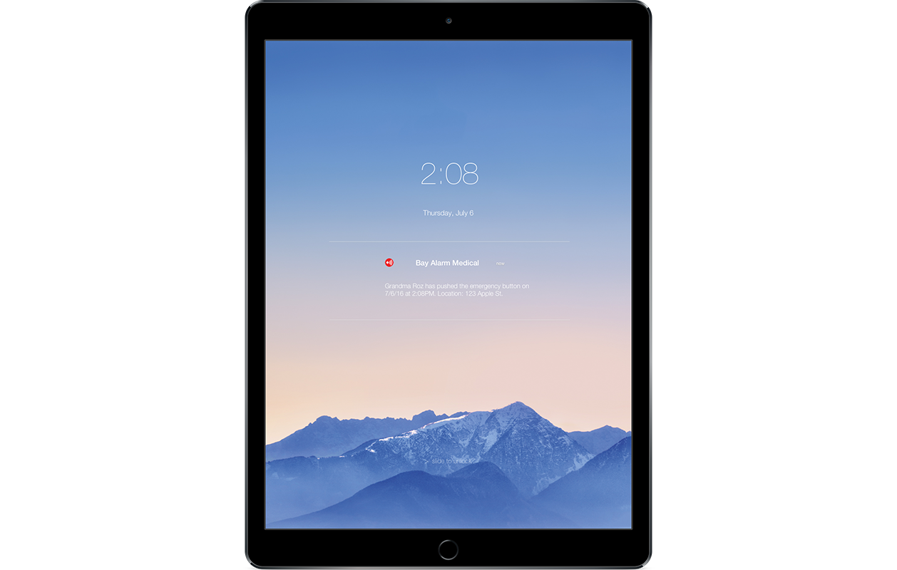
Information Architecture: While the core of our app is notifications, we found it necessary to include the “should have” section: chat, medical history, contact list, and timeline. During an emergency, having access to information is important, as well as being able to communicate with your loved ones immediately, so we created a chat screen and set that as the home screen. This saves people time from having to search for every family member to create a group text.

chat feature is the home screen
With the new system, movement of knowledge gets to family members more quickly.

Paper Prototype: Once we were clear with what our app would have, we tested a paper prototype with 6 users to see how understandable, easy, and effective it was. We wanted to stay in as low-fidelity as possible to ensure that our solution really solved the problem.

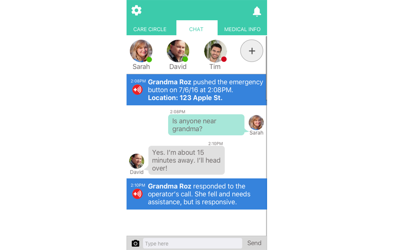
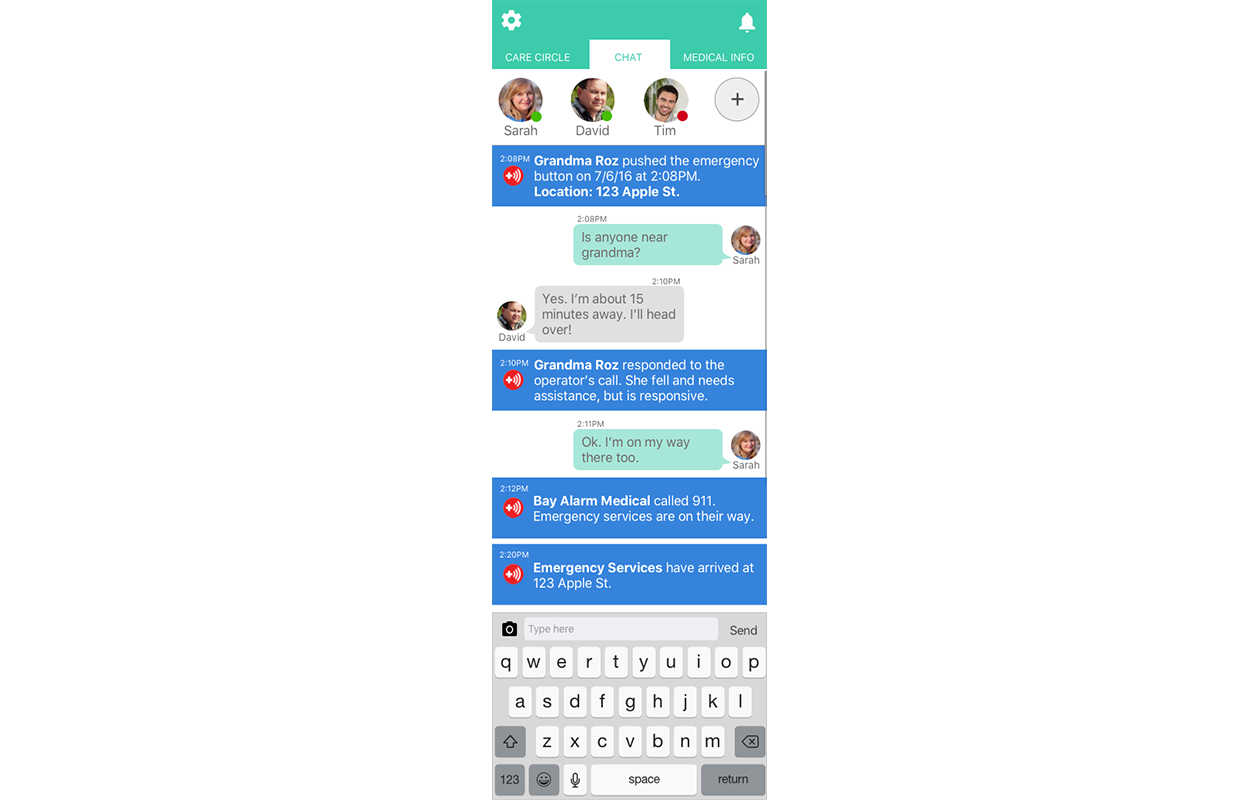
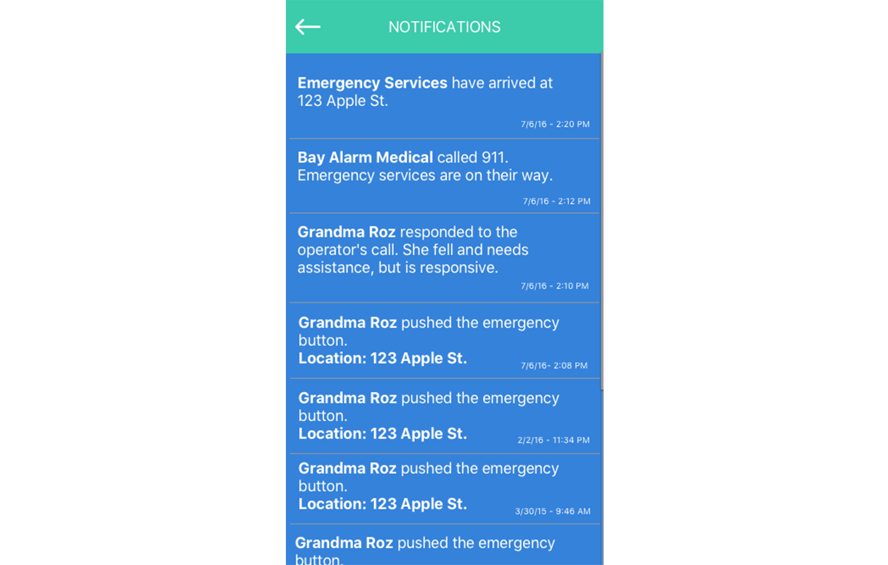
Wireframes: Once we iterated on our paper prototype, we transferred the design into wireframes and retested it to solidify our design. We learned that we should develop more of the notifications and chat story in order to help people get a better understanding of how this would work in an emergency.

developing a full chat story helps users understand scenario
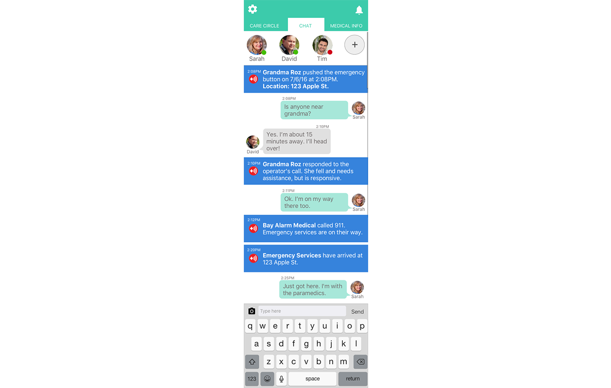
Usability Testing: We did 7 total testings. A key insight was that the notifications were not providing enough information and some of the wording were inaccurate, which was valuable feedback since information is the center of our design.
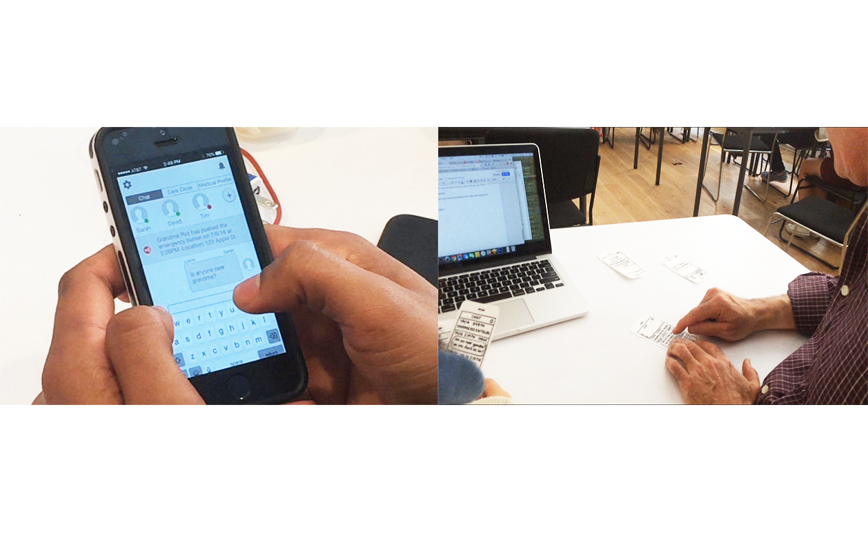
Other feedback included wanting to know where the situation’s location was and not noticing that the notification alerts were clickable, which helped us notice the details that we were missing.
Visual Design: After achieving a clear and effective flow, we added visual design and created an interactive prototype. Putting visuals as our last step in the process allowed us to spend more time developing an app that 1.) works and 2.) works well, two aspects that are critical during times of crisis.

Success Metrics: Success will be measured by the percent of successful interactions, which means a faster response time for Bay Alarm to contact families and for the situation to be resolved. Another way is to ask users how they felt about the app, with positive feedback meaning success. There are also other metrics like the amount of active users and product subscriptions.
Redesigning the Device

current device
In order to have a successful app and system, the senior must wear the medical alert device. Based on survey results, a large portion of seniors do not want to wear it, which is why it must be redesigned. From interviews and customer reviews, top reasons include:
- Unattractive
- Bulky
- Uncomfortable
- Hard to put on/off

With this information, we set out to redesign the device to address these concerns.
Comparative Analysis: In order to get a better understanding of the industry standards for wearable technology, we looked at what’s currently in the market: Fitbit, Apple Watch, and Lively. We investigated their design, materials used, and functionalities, making a list of how we can leverage them to our device.

The New Design:
- waterproof (can wear the device 24/7 and not worry about removing it to shower)
- stretchy silicone band (easy to put on and off without rubbing on the skin)
- kinetic battery (battery will run based on movement so no charging will be needed)
- physical button with grooves (so the device can be accessible to those without great eyesight)
- GPS tracking (to provide the location of crisis in notifications)
- activity monitor (a future idea to measure heart rate)
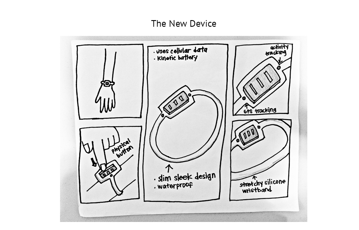
Wearing a hospital-looking device can make one feel monitored, while an attractive design could spark sentiments of empowerment.
Conclusion: Our solution improves the experience for everyone involved. Seniors can feel comfortable knowing that if something were to happen, loved ones will know and help will be on its way. Families can relax knowing that they will be the first to know when a crisis occurs. Paramedics can provide faster service by having the senior's medical information in the app. Bay Alarm can have a more successful business by having more satisfied customers.
Our design instills the belief that the people in our lives matter and that we should be connected with each other throughout our lives, no matter what age.
Details
Cole Hardware

An online shopping website
Veteran Affairs

A mental health app