


thredUP
thredUP is the world’s largest online thrift shop with over 40,000 fashion brands for women and kids.
Project Overview:
● Sole designer for mobile apps (iOS/Android) team.
● Team: 1 designer, 3 engineers.
● Duration: 2 months.
Project Overview + Problem (Why are we overhauling this design?)
thredUP is an e-commerce marketplace for used clothing. Since each item is unique, users have 24hrs to make a purchase after an item has been added to their cart. After 24hrs, the item is dropped from the cart and users will have to look for it again. The purpose of this design is to help users save that item so they no longer have to look for it. What we did here is added the ability to save an item on the product listing page, another page to view all of your saved items, and a way to easily add those items back to your cart. The company is hoping this feature will increase CTR, add-to-cart, and conversion rates.
Problem #1: When items drop from cart after 24hrs, it is not easy for users to find those items again.
Problem #2: There is no way to view items you like outside of the cart.
Solution #1: Create a way for a user to favorite an item (at multiple touch points).
Solution #2: Have a page dedicated for all of a user’s favorited items.
Solution #3: Within that page, have a label of an item’s status (reserved, in your cart, sold).
Solution #4: Create a way to move items from your favorites back to your cart for purchase.
The Design Process
Gather Requirements
The first step is understanding the problem I am trying to solve and what the goal is. The company’s goal is to increase CTR, ATC, and conversion rates at the cart and product pages. They know there is some difficulty with users with the cart timeline. They want to find a way to improve upon it. The team has many ideas on what we can do to improve, but we cannot do them all, so I rank them by order of importance.


Research
User research (interviews, survey, data) is conducted to help us learn more about their goals and how we can make things better.
I asked the customer service lead for all user feedback and he told me the top complaint was items disappearing and not being able to find them again.
I also look at data on Looker to see what the current metrics are to analyze behavior and problem areas (low add to cart to purchase ratio).
I prepare for user interviews by creating a testing script with a list of questions to ask users about who they are, their goals, their scenario, and their pain points. I conducted 3 user interviews with experienced users internally and 3 interviews with our customers through Zoom. I asked users to share their screen when using our product and observe their reactions and behavior while taking notes.
I also emailed a survey to our customers list asking questions regarding improvements we can make and what they would like to see from the product.
After gathering all the feedback, I place each one on a sticky note and organized it based on frequency. My goal is to find the most common pain point across many different users. This is where unmet user needs are and where a solution can be made to address it. The results were that the user’s main needs and pain points were wanting a way to keep the items that they like when they haven’t made a purchase yet. Although there were other moderate-low pain points, this was the most crucial. Thus, our design became centered around this problem.
I created a persona with this specific need in mind. By putting an identity to a user, it helps me keep their goals in mind while I am creating the design for them.
Persona:
Jessica
Facts: 25 - Hotel Receptionist
Behavior: Likes to browse and pick up items to look at. Does not make immediate purchases. Likes to wait a few days or more before making a purchase.
Scenario: She previously added several dresses to her cart that she liked but was not sure which one to get. Because of the 24hr timeline, her items dropped from cart. She tried to go back to the shop to manually search for it, but could not find it. In the future, when an item drops from cart, she does not bother looking for it anymore.
Pain Points: Items disappearing. Can’t find it again. Needs more time to decide on whether she wants to buy an item.
Needs/goals: A way to have access to the items she loves.


Planning (Before Designing)
The strategy is to look at our current system and to create a new system that’s better. I determined where this feature will live within our product (product page, product listing page, create a new bottom navigation bar, cart page), where users interact with, and which metric to focus on. I created user flows to have a better idea if this redesign will be decreasing the time it takes to checkout and to find the product again. Based on the before and after user flow, the new flow will improve the time, making it more efficient for the user to accomplish their goal.


Ideation Brainstorm (What will this look like?)
I brainstorm different ideas through wireframes and I’ll look at our competition to see how they are doing it. By doing competitive analysis, I discovered our competitors like Poshmark, Rebag, and TheRealReal all have a wishlist, while we do not, which means we are not competitive enough with the market. I analyze their product and feature to further discover what they are doing well in and what they could improve upon. I take notes and try to keep them in mind for when I am designing.
I also create a user flow with different scenarios and a prototype to see how the interaction would work and if they solve for various user needs. Some flows to think through were what happens if they do not have any favorited items yet and how can we show them they can add their favorite items back to their cart. I then share these with engineers/PM/designers during a review session and iterate based on feedback.

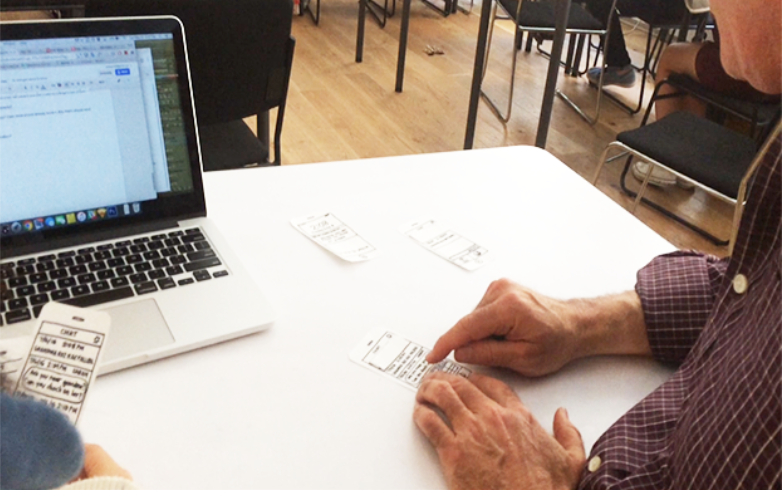
Usability Testing
I created a testing script for usability testing and we tested a paper prototype with 3 users to see how understandable, easy, and effective it was. We wanted to stay in as low-fidelity as possible to ensure that our solution really solved the problem. An insight was that the heart symbol was quite clear among users, as this icon is often used in competitors. Luckily we did competitive analysis before so we knew we are not creating something new and confusing for our user base! For any areas where users had confusion or difficulty, I wrote down in my notes and I relooked at it afterwards to see how I could make it easier to understand.
Once the usability testing results were incorporated into the design, I focus on the details, from the visual design to the specs. I refer to the style guide to ensure consistency and I explore new paths, such as animated micro-interactions. I share my work with the team for review and incorporated their feedback.


Post-Design (Testing, Metrics)
After a prototype is made, I conduct usability testing with 3 users externally and 3 internally to validate the designs and do A/B testing on whether this feature and flow is understandable and meets their needs. I rework on the problematic areas in the design in the final iteration before passing it to engineers. Once engineers build it, I look over it to ensure it matches the design. If there are discrepancies, I take notes and share it with the engineer. If necessary, we sit side-by-side and work on it together. After it’s launched, I check the design again for errors and look at the metrics, which came to be a 15% increase in engagement in the favoriting icon, +0.5% increase in ATC, and a +0.1% increase in conversion rate. Our team considers this a success because of positive feedback from our users and an increase in CTR, ATC, and conversion after the design compared to before the design.
Reflection
Some of the challenges I faced in this project were:
- How should we integrate this new feature in our current design in a way that is seamless and makes sense?
- Are there more features that could’ve been implemented in this design that would have made it more useful?
- Rather than building this feature, is there another way to have items not drop from cart? Or is this the best solution?
- If we didn’t include a new bottom navigation bar to have access to the favorites page, where could we put it? Would it be even better than this bottom bar?
- Where to show a heart and in what way that's intuitive for users?
- Do users understand what the heart and # means?
- The add-to-cart button is originally a full-width rectangle on the bottom. How do we add another CTA and make it look cohesive together? Do we need to make tradeoffs to the header and image in order to make room for the new CTA?
I believe long term this feature would lead to an increase in purchases since users can now have a place to easily view all of the items that they like. Short term, I’m positive it has made the user experience of shopping much better.
More Work

My Closet
A new way to view your closet, select your outfit, and make a purchase.

Reset Password
Our new and improved reset password experience. The checkmark and X states are added to help users see whether their password matches before they hit the update password button.

Size Chart
The first size charts (and also responsive across multiple device sizes). Giving customers a better idea of how an item would fit before they make their purchase.

Recently Removed Items
Added items that have been dropped from cart to encourage users to consider purchasing.
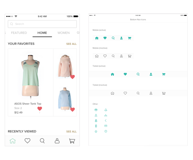
Bottom Navigation
Created a new bottom navigation bar across iOS and Android. Redesigned all app icons and helped decide what was the most important access points in the navigation.

Seller History
Created a way to view all the items a user has sold and how to edit the listing price of those items.

Refer a Friend
Updated old designs by making it cohesive across web and mobile.
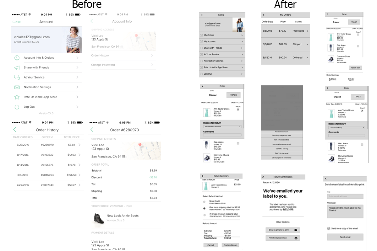
Returning an Item (wireframes)
Provided a way for users to return an item and track their order.
Onboarding
Helped new users learn more about thredUP after installing the app.

Launch Screen
Redesigned the intro screen so it can have a unified look across platforms. Integrated a parallax effect in the swiping gesture.

Sign Up
Added delightful and easier-to-use interactions.
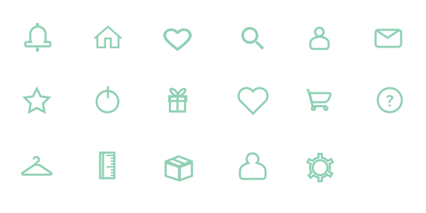
Icon Design
Created a new set of icons across iOS and Android.